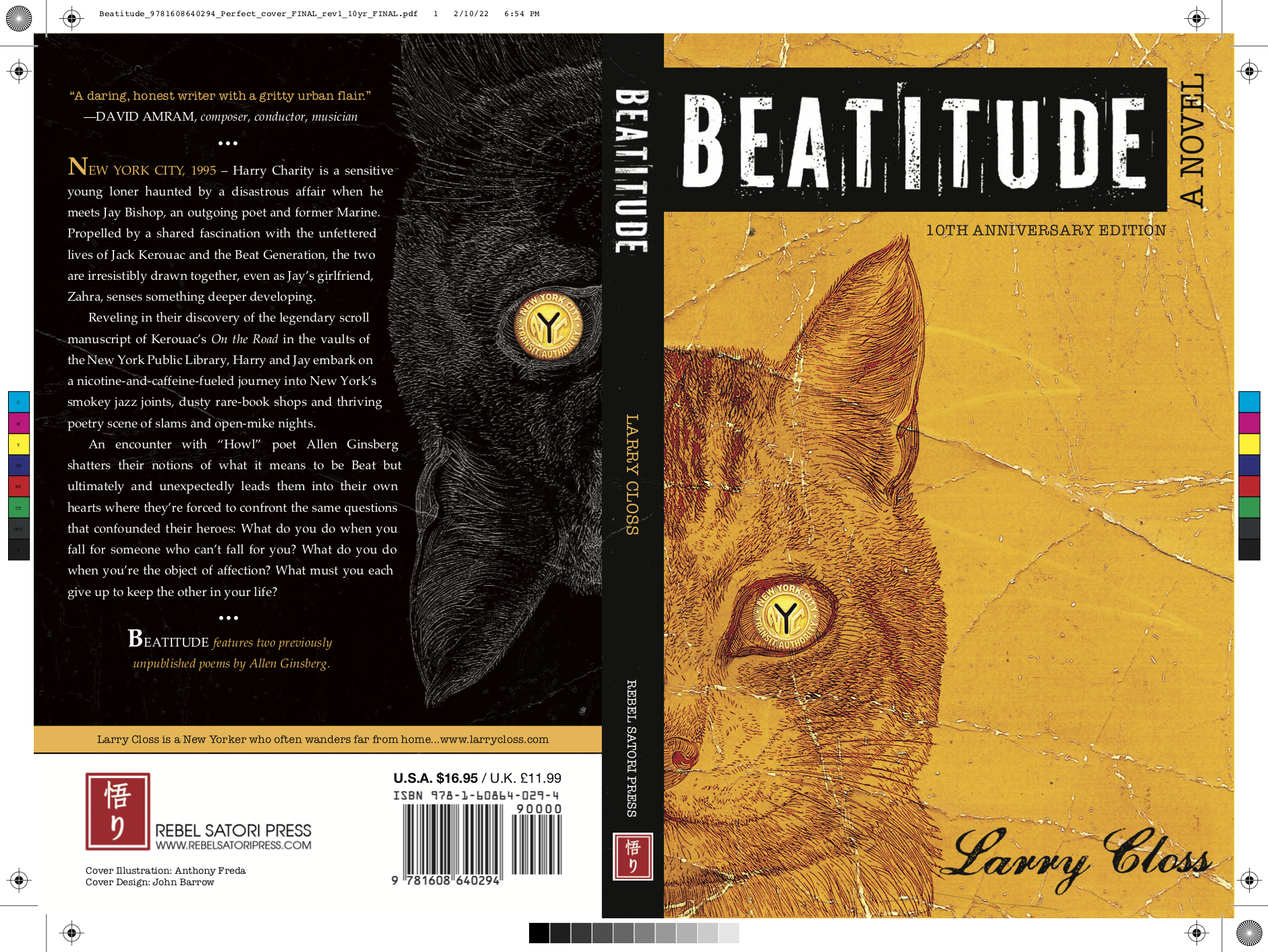
Every author imagines what the cover of their book might look like. In most cases, it’s the first visual representation of all the purely conceptual work that went into writing the book. I’m not an illustrator or a designer, but I co-owned a design studio for several years and have a design sensibility. To get ideas for the cover of Beatitude, I studied hundreds of covers on websites like Book Cover Archive. I also visited bookstores, stared at walls and tables of books and noted which ones caught my eye. I wasn’t trying to come up with a design, just an approach.
A friend put me in touch with Anthony Freda, an incredible editorial illustrator and visual political activist who is also part of the adjunct faculty of the Fashion Institute of Technology in New York. In addition to many mainstream clients, such as Time, The New Yorker, Rolling Stone and The New York Times, he also contributes to many alternative news websites and publication, such as Code Pink, Activist Post, Washington’s Blog, Global Research, Cindy Sheehan’s The Soapbox and The Trends Journal. In 2006 The Village Voice commissioned Anthony to illustrate a story about people who challenge the official 9/11 narrative and the artwork has since become part of the permanent collection of The National September 11 Memorial Museum.
Anthony read Beatitude, liked it and agreed to do the cover. He asked me if I had anything in particular in mind. I said only that I preferred covers that were simple, iconic and graphic. We talked about some of the book’s key elements and images. Anthony latched onto the cat and the subway token and combined them with a distressed-paper background and grungy typography to create an intriguing, eye-popping cover that is simultaneously classic and contemporary.
Another amazing designer, John Barrow, created the equally important spine and back cover, which features a reverse image of the cat on the front cover—the yin to the yang that figuratively reflects Beatitude’s two main characters, Harry and Jay. John also pointed out just how perfect the image of the cat and the subway token are: Short of a Buddha, nothing but a contented cat could better represent a state of beatitude. And nothing conjures New York City—and the journey that Harry and Jay undertake—like a subway token.
I am thrilled with the cover and eternally grateful to Anthony and John for illuminating the intangible and making it look magnificent.
